Graphing Post

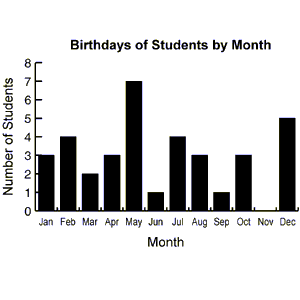
Bar graph
Advantage
-compares data across categories
-make sure your intervals show the data right
Disadvantage
-only compares one set of data
-if intervals are wrong can be not accurate

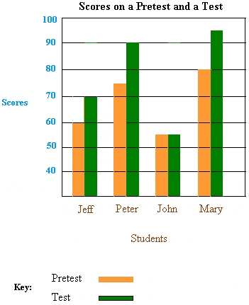
Double bar graph
Advantage
-it compares two sets of data across categories
Disadvantage
-if the intervals are not correct it may make the graph not accurate

Line graph
Advantage
-compares change in data over time
Disadvantage
-You have to use data that happens over time
Pictograph
Advantage
-compares data and can easily be seen by the pictures
-can count pictures easily
Disadvantage
-sometimes can't see the exact amount of data
example you cant show 2.5 on this graph
Pie graph
Advantage
-compares data part to whole using percents
Disadvantage
-you have to know what the parts are out of
-it takes a long time to make if its not already in percents
2. How can graphs be misleading. Show 3 ways.

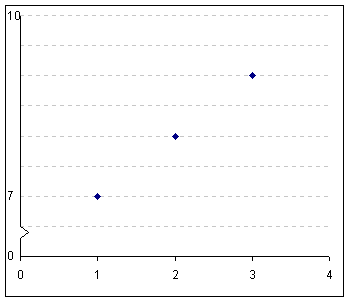
Putting a break on the y-axis
Distorting the visuals (making a visual/symbol larger than the rest)

Distorting the the size of a bar (making a bar wider/ putting more area inside a bar)
I could not find a picture for this
2a) The following chart shows Pizza Sub Sales over a month. What 2 graphs would show the information accurately?
I think a bar graph and line graph more accurately
2b) If you were selling Pizza Subs would you continue? How does your graph explain your answer.
2b) If you were selling Pizza Subs would you continue? How does your graph explain your answer.

Yes I would countine selling pizza subs because pizza sub sales are getting better.
Below you see 2 different examples of graphs showing healthy choices sold at the canteen. If you had to convince Mrs Mota that we should continue selling healthy choices which graph would you choose?
Below you see 2 different examples of graphs showing healthy choices sold at the canteen. If you had to convince Mrs Mota that we should continue selling healthy choices which graph would you choose?
I would choose the pictograph because it shows that we can see 2.5 more hearts in November than in October.

4a) Change each graph so that your information looks even MORE impressive. You may not change the
data just the graphs

 ( For some reason I could not add a tittle to it so sorry)
Here is a video that I thought would help
I hope this post helped


0 comments:
Post a Comment
Note: Only a member of this blog may post a comment.