Bar Graph:
Advantage- It is best for comparing data across categories.
Disadvantage- If the interval is too large then you won't be able to see the range between each bar easily.
Double Bar Graph:
Advantage- It is best for comparing 2 sets of data across categories.
Disadvantage- If the interval is too large again then you won't be able to see the range between each two bars easily.
Line Graph:
Advantage- It is best for showing changes in data overtime.
Disadvantage- It can be hard to find out what each number is because it may not be accurate.
Circle Graph:
Advantage- It is best for comparing categories to the whole using percents. The sum of all the percents in a circle graph is 100%
Disadvantage- This graph is only used for graphs dealing with percents.
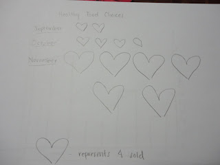
Pictograph:
Advantage- It is best for comparing data that can be easily counted and represented using symbols.
Disadvantage- It doesn't give the exact number of each category so it is harder to find out.
2:
3 misleading graphs ....
2a) The 2 graphs that would show it accurately would be a line graph and a bar graph.
2b) Yes I would keep selling the pizza subs because each week there are more items being sold.

4: I would choose the line graph because it shows how each month more and more people are deciding to buy the healthier foods rather than the other ones.
4a):


0 comments:
Post a Comment
Note: Only a member of this blog may post a comment.